หน้า: [1]
 
ผู้เขียน หัวข้อ: อยากรู้ว่าทำไมต้องมีตัวนี้  (อ่าน 6890 ครั้ง)
0 สมาชิก และ 1 ขาจร กำลังดูหัวข้อนี้
ผมเปิดฟอนต์ของ Np Template ดูก็เจอฟอนต์ตัวนี้   เปิดฟอนต์ของ Ansana upc ดูก็เจอ เจอเกือบทุกฟอนต์เลยครับ เลยอยากรู้ว่าทำไมต้องมีตัวนี้ด้วย
บันทึกการเข้า
ไม่ต้องสนใจก็ได้ครับ ใส่ใจทำไมเด็กสมัยนี้...
บันทึกการเข้า

สะพรึบสะพรั่ง ณหน้าและหลัง ณซ้ายและขวา ละหมู่ละหมวด ก็ตรวจก็ตรา ประมวลกะมา สิมากประมาณ
โธ่บอกหน่อยเถอะนะครับ อยากรู้จริงๆ
บันทึกการเข้า
อย่าไปสนใจคำตอบของไอ้เคนมันครับ ไอ้นี่รั่ว ง่ะ


อักขระตัวนั้นมีไว้ขำๆ เล่นๆ ครับ
นึกภาพเวลาคุณพิมพ์ฟอยต์ที่โปรแกรมอะไรสักอย่างเปิดดูไม่ไดเ้ มันก็จะขึ้นเหลี่ยมๆ นี่มาทุกทีไป
แม้จะไม่มีใครต้องการก็ตาม

นั่นละครับ ประโยชน์ของเหลี่ยม
บันทึกการเข้า

ทำมาหากินด้วยการเปิดร้านสกรีนเสื้อยืด จ้ะ
อ้อ ขอบคุณมากครับ นึกว่าจะไม่มีใครตอบซะแล้ว
บันทึกการเข้า
พิมพ์ฟอยต์  คริคริ
บันทึกการเข้า

ที่สุดถ้ามันจะไม่คุ้ม
แต่มันก็ดีที่อย่างน้อยได้จดจำ
ว่าครั้งนึงเคยก้าวไป...
ชิ
บันทึกการเข้า

ทำมาหากินด้วยการเปิดร้านสกรีนเสื้อยืด จ้ะ
มีไว้ดูต่างหน้าน่ะครับ เหลี่ยมๆ กันคนลืม
บันทึกการเข้า

ในหมู่คนตาบอด คนตาบอดข้างเดียวได้เป็นราชา
TrueType outline fonts should have the following four glyphs at the beginning of a font. These were listed in Apple's original TrueType specification. These glyphs are recommended to allow for the same version of the font to work on both Windows and Macintosh.


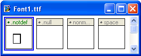
Glyph 0 is the .notdef (missing character) glyph.
Glyph 1 is the .null glyph; it has no contours and zero advance width.
Glyph 2 is the nonmarkingreturn glyph; it has no contours and positive advance width.
Glyph 3 is the space (and no-break space) glyph; it has no contours and positive advance width.

* For the Macintosh platform, all unmapped characters are mapped to the first glyph.

Glyph 2 and 3 should have the same advance width.

The .notdef glyph is very important for providing the user feedback that a glyph is not found in the font. This glyph should not be left without an outline as the user will only see what looks like a space if a glyph is missing and not be aware of the active font's limitation.

It is recommended that the shape of the .notdef glyph be either an empty rectangle, a rectangle with a question mark inside of it, or a rectangle with an "X". Creative shapes, like swirls or other symbols, may not be recognized by users as indicating that a glyph is missing from the font and is not being displayed at that location.

© 1997-2005 High-Logic The Netherlands

คิดถึงเหลี่ยมคนไกลบ้าน  หน้ามึน
บันทึกการเข้า

NP Freedom
i am a slow walker, but i never walk backwards.
Abraham lincoln
ทราบแล้วจ้า แต่ผมแปลอังกิดมะออกอ่า เหอๆๆ ง่ะ
บันทึกการเข้า
ก็พยายามสิครับ
บันทึกการเข้า

นักเขียนการ์ตูนรายปี
missing character
บันทึกการเข้า
เราทำอย่างอื่นที่ไม่ใช่เหลี่ยมได้ไหมคะ

 หมีโหดดดด
บันทึกการเข้า

ตามหารักแท้ค่ะ โฮกกก
ได้ครับ  ฮิ้ววว

ทำเป็นรูปหน้าหมีก็ได้  หมีโหดดดด
แค่มันจะไม่ค่อยสื่อเท่านั้นเอง
บันทึกการเข้า
ได้ครับ  ฮิ้ววว

ทำเป็นรูปหน้าหมีก็ได้  หมีโหดดดด
แค่มันจะไม่ค่อยสื่อเท่านั้นเอง

และไม่มีใครอยากได้ด้วยครับ หมีน่ะ
บันทึกการเข้า
หน้า: [1]
 
 
Powered by MySQL Powered by PHP Powered by SMF 1.1.21 | SMF © 2006-2007, Simple Machines | Thai language by ThaiSMF Valid XHTML 1.0! Valid CSS!