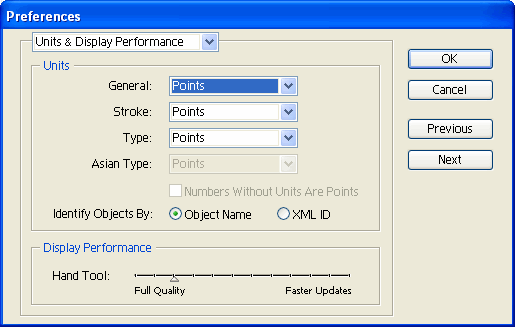
หน้า: [1]
 
ผู้เขียน หัวข้อ: Using Illustrator to draw typefac  (อ่าน 43371 ครั้ง)
0 สมาชิก และ 1 ขาจร กำลังดูหัวข้อนี้
..

Using Illustrator to draw typefaces
The following is an improved version of this tip.

A. Preparing your font.
1. In FontLab, create a new font (File | New).

2. Go to File | Font Info | Metrics and Dimensions. Set the size of the emsquare of the typeface in units-per-em (UPM). Emsquare is the design size of your typeface: when using your font in an application, if the user sets the point size to 12 point, it actually means that the emsquare will be scaled to 12 points. The default size of 1000 UPM suggested by FontLab is fine for most uses, so you can leave it as is.

3. Go to Key Dimensions and define the sizes of the Ascender, the Descender, the Caps height and the x-height. Ideally the result of Ascender – Descender should equal the size of the emsquare. To set the correct values, measure selected letters of your design (H for caps height, d for ascender, x for x-height, below-baseline part of p for descender). You can measure your drawings on paper, or your Illustrator drawings — the principle is the same.

4. Let's assume that your caps are 40 mm high (approx 1.574803 inches), your ascenders 42 mm high, your x-height is at 28 mm above baseline and your descender at –15 mm (that is, 15 mm below baseline). Then, 42 – (–15) = 57 which shall correspond to your emsquare size (1000). So your caps height should be approximately (40 / 57 * 1000) = 702, ascender (42 / 57 * 1000) = 737, x-height (28 / 57 * 1000) = 491 and descender (–15 / 57 * 1000) = –263. Since 737 – (–263) = 1000, your settings are correct.

B. Creating lettering in Adobe Illustrator
1. In Illustrator, go to Edit | Preferences | Units & Undo or Units & Display Performance. Change all units to points (1 point is equal to 1 unit in FontLab).

2. Go to Preferences | Files & Clipboard. Disable PDF, enable AICB and select Preserve Paths.

3. In Preferences | Guides & Grid, set Gridline every: 10 pt and Subdivisions: 10.

4. Select File | New. Set the width of the document to be the same as the emsquare size (UPM) of your font (e.g. 1000 pt). Set the height of the document to be the same as emsquare – descender (e.g. 1000 – (–263) = 1263 pt).

5. Select Window | Info, View | Show Rulers, View | Snap to Grid. Disable View | Guides | Lock Guides. Optionally select View | Show Grid.

6. Click on the top ruler and drag a guideline. Position it at the height that has the same (positive) value as the (negative) descender of your font (e.g. 263 in our example).

7. From the left ruler, drag a guideline and position it at 0.

8. Click at the top left corner of the screen (where the top ruler and the left ruler meet) and drag the "ruler origin" to where the two guidelines you have just drawn cross.

9. Click on the top ruler and drag guidelines to the positions of your ascender, x-height, and caps height.

10. Now you can draw your letters. Remember to assign some kind of fill to all your Illustrator drawings since FontLab won't import paths with neither fill nor stroke.Also remember that your letters should never exceed the bottom or the top of the document size.

11. If you have already drawn some letters before, copy them to the newly created document, place and re-scale so that they fit between the respective guidelines you've drawn. Remember that all points of your letters much snap to the grid (otherwise FontLab will round their position). If you think that you need a grid with a finer precision, increase the emsquare size (e.g. to 2000 UPM) both in FontLab and in Illustrator (by changing the document size). Remember to update your key dimensions accordingly.

C. Importing your drawings to FontLab
1. When you finished drawing your glyph in Illustrator, choose Select | All, Edit | Copy.

2. In FontLab, go to Preferences | General | Do not rescale EPS (preferences are located at Edit | Preferences on Macintosh, and at Tools | Options on Windows).

3. Open a Glyph window and choose Edit | Paste.

Adam Twardoch
« แก้ไขครั้งสุดท้าย: 03 มิ.ย. 2006, 20:29 น. โดย Naipol » บันทึกการเข้า

NP Freedom
i am a slow walker, but i never walk backwards.
Abraham lincoln
ข. การสร้างชุดอักษรในอีรัตน์

๑. ในอีรัตน์ ให้ไปที่ Edit | Preferences | Units & Undo หรือ Units & Display Performance (แล้วแต่ version) ให้เปลี่ยนยูนิตทั้งหมดให้อยู่ในรูป point (1ป๊อยต์เท่ากับ 1ยูนิตในฟอนต์แลบ)


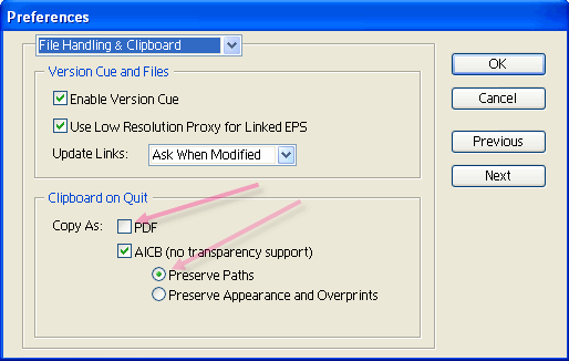
๒. ไปที่ Preferences | Files & Clipboard.ติ๊กปุ่ม PDF ออก, แล้วไปเปิดปุ่ม AICB เลือกตรง Preserve Paths.


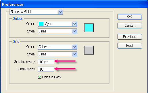
๓. ตรง Preferences | Guides & Grid  ให้ตั้งค่า Gridline every เป็น 10 pt และ Subdivisions: 10.


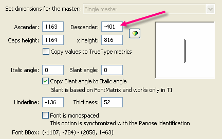
๔. สร้างเอกสารใหม่ (เลือก File | New) ตั้งค่าความกว้างของเอกสารให้เท่ากับไซต์ของฟอนต์คุณ (UPM)  เช่น 1000 pt .  ตั้งค่าความสูงของเอกสารให้เท่ากับ  UPM -ค่า descender
(เช่น 1000 -  (-263) = 1263 เป็นต้น)

ตัวอย่างจาก Template ทั่นนายพล แต่ผมทำส่วนภาษาไทยอยู่ที่ 401


เพราะฉะนั้นให้กำหนด ความกว้างยาวในอีรัตนต์
W = 2048 pt 
H = 2449
(2048 - (-401))

๕. ในอีรัตน์ให้เลือก Show Rulers  , Show grid  , Snap grid  แต่ไม่ต้อง Lock guide นะเอาออกซะ

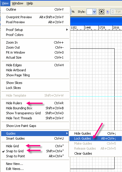
**ตัวที่เขียนว่า hide แปลว่าโชว์ไปแล้วนะจ๊ะ

๖. คลิกที่ไม้บรรทัด ลากเส้นไกด์ ลงมาที่จุดเดียวกับความสูงตามขนาดฟอนต์่ใน fontlap ของคุณ
เช่น 401 

๗. ลาก Guide ด้านซ้ายให้อยู่ทึ่ตำแหน่ง 0

๘. คลิกที่มุมซ้ายบน (ตรงจุดที่ไม้บรรทัดบนและข้างเจอกัน) เอาลากเอาจุดออริจิ้นมาไว้ตรงที่เส้นไกด์ ตัดกัน

๙. จากนั้นก็ลากเส้นไกด์ตามตำแหน่งต่างๆ เช่น ascender  x-height  และ caps height


แอบอ้าง
ข้อ ๖-๙ เขาเขียนงงๆเดี๋ยวจะย่อยง่ายๆให้นะครับ
- ให้สร้างเส้นไกด์สองเส้น ที่มีความกว้างระกว่าเส้น เป็น 401 (หรือตามขนาดความสูงของ font ที่คุณต้องการ) ง่ายๆ คือสร้างก่ล่องที่มีความสูง 401 pt ซะเลย
- เอาจุดออริจิ้นมาวางที่ตำแหน่งซ้ายล่างของตัวอักษร
- เพื่อความสะดวกก็เพิ่มพวก X height / cap height / และอื่นๆ

ตามรูป


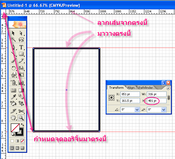
๑๐. โอ้ว ตอนนนี้คุณก็สามารถสร้างตัวอักษรได้แล้ว แต่เดี๋ยวก่อนอย่าลืมว่าเส้นที่สร้างเนี่ยให้ใส่ fill ไม่ก็ stoke ด้วยนะ เพราะว่า fontlap ไม่สามารถ import  path ที่ไม่มีการ fill หรือ stoke ได้นะจ๊ะ


11. If you have already drawn some letters before, copy them to the newly created document, place and re-scale so that they fit between the respective guidelines you've drawn. Remember that all points of your letters much snap to the grid (otherwise FontLab will round their position). If you think that you need a grid with a finer precision, increase the emsquare size (e.g. to 2000 UPM) both in FontLab and in Illustrator (by changing the document size). Remember to update your key dimensions accordingly.


ข้อ 11 ขี้เกียจแปลครับ แค่นี้ก็ copy จากอีรัตน์มาใช้ได้แล้ว
« แก้ไขครั้งสุดท้าย: 02 มิ.ย. 2006, 18:00 น. โดย Layiji » บันทึกการเข้า

นักเขียนการ์ตูนรายปี
เอ้อ ดีๆ  (+1) เลย์จิ และคนอื่น
บันทึกการเข้า

nuugo.blogspot.com
instagram.com/nuugo
เรียบร้อยแล้วจ้า ย่อยให้เสร็จด้วยการทดลองจริง
บันทึกการเข้า

นักเขียนการ์ตูนรายปี
เราใช้วิธี


copy ตัวอักษร ของท่านนายพล แล้วมาวางที่อีลาส

แล้วก็กำหนดเป็นเกณฑ์คร่าวๆไว้

ตั้งค่าเยอะแล้วมึน
« แก้ไขครั้งสุดท้าย: 10 พ.ค. 2007, 11:34 น. โดย password » บันทึกการเข้า

 กรี๊ดดดดด กิ๊ซ

เค้าทำกันอย่างนี้นี่เอง
คนละ (1+)
บันทึกการเข้า
เจ๋ง ขอบคุณครับ
(ขอลบโพสต์ก่อนหน้าออกไปแล้ว หวังว่าคงไม่ถือสา)
บันทึกการเข้า

ทำมาหากินด้วยการเปิดร้านสกรีนเสื้อยืด จ้ะ
แจ่มเลยครับ  เจ๋ง
บันทึกการเข้า

NP Freedom
i am a slow walker, but i never walk backwards.
Abraham lincoln
ขุดครับ ไปเจอบทความฝรั่งมาเกี่ยวกับการสร้างฟอนต์ด้วยอีรัตน์เหมือนกัน
แล้วก็มีวิธีอธิบายแบบกระชับได้ใจความด้วยแหละ


อ่านนี่: http://www.olliekav.com/2008/08/13/creating-a-font-part-two/
เอามาอ่านประยุกต์เข้ากับฟอนต์แบบไทยๆ คงเข้าที เจ๋ง
บันทึกการเข้า

ทำมาหากินด้วยการเปิดร้านสกรีนเสื้อยืด จ้ะ
ขุดครับ ไปเจอบทความฝรั่งมาเกี่ยวกับการสร้างฟอนต์ด้วยอีรัตน์เหมือนกัน
แล้วก็มีวิธีอธิบายแบบกระชับได้ใจความด้วยแหละ


อ่านนี่: http://www.olliekav.com/2008/08/13/creating-a-font-part-two/
เอามาอ่านประยุกต์เข้ากับฟอนต์แบบไทยๆ คงเข้าที เจ๋ง
เจ๋ง
บันทึกการเข้า
ขยายต่อ
http://haikumonkey.net/?p=42
บันทึกการเข้า
มันเยี่ยมมาก กรี๊ดดดดด (ขุดมากันลืม) (แต่ลิงก์ในโพสต์ท้ายๆ นี่หายไปหมดแล้วนะ เสียดายๆ)
บันทึกการเข้า

ทำมาหากินด้วยการเปิดร้านสกรีนเสื้อยืด จ้ะ
หน้า: [1]
 
 
Powered by MySQL Powered by PHP Powered by SMF 1.1.21 | SMF © 2006-2007, Simple Machines | Thai language by ThaiSMF Valid XHTML 1.0! Valid CSS!